


* 겪고 있는 문제 상황을 최대한 자세하게 작성해주세요.
* 문제 해결을 위해 어떤 시도를 해보았는지 구체적으로 함께 알려주세요.
선생님 처럼 안 나와요. 너무 극단적으로 나와요. 에러 메시지도 뜨지 않습니다. ㅠㅠ 왜 y축 숫자가 저렇죠...ㅠㅠ
보고 계신 화면 전체를 캡처
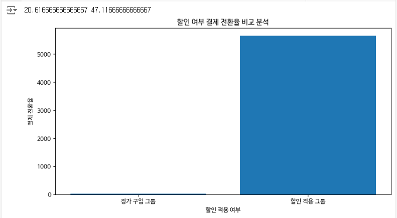
해 주시면, 튜터님들이 빠르게 상황을 이해할 수 있어요.
작성한 코드 및 에러 메세지
import pandas as pd
import numpy as np
import matplotlib.pyplot as plt
plt.rc('font', family='NanumBarunGothic') #한글 깨짐 방지 글꼴 설정
sparta_data = pd.read_table('/content/user_db1.csv',sep=',')
sparta_data.tail()
#할인 혜택 받은 사람의 결제 수
sum_of_students_by_discounted = sparta_data[sparta_data['group']==1]['user_id'].count()
sum_of_students_by_discounted
#할인 혜택 받지 않은 사람의 결제 수
sum_of_students_by_not_discounted = sparta_data[sparta_data['group']==0]['user_id'].count()
sum_of_students_by_not_discounted
#각 결제 인원에서 실제 실험 인원인 12000명을 나누고 각 퍼센테이지 구하기
percent_of_students_by_not_discounted = sum_of_students_by_not_discounted/12000 *100
percent_of_students_by_discounted = sum_of_students_by_discounted/12000 *100
print(percent_of_students_by_not_discounted , percent_of_students_by_discounted )
#그래프 사이즈
plt.figure(figsize=(10,5))
#x 그룹 지정하기
x_list =["정가 구입 그룹", "할인 적용 그룹"]
#y 값
#각각 어떤 값이 들어가야 하는지 입력해 볼까요?
y_list = [percent_of_students_by_not_discounted ,sum_of_students_by_discounted]
#x,y값 설정
plt.bar(x_list, y_list)
#그래프 타이틀
plt.title('할인 여부 결제 전환율 비교 분석')
#x축 레이블
plt.xlabel('할인 적용 여부')
#y축 레이블
plt.ylabel('결제 전환율')
#그래프 보여주기
plt.show()오류 발생 시, 작성한 코드 전체와 에러 메시지를 첨부해 주세요.
Tip 1) </> 아이콘을 눌러 코드박스를 만들어 보세요.
Tip 2) Ctrl+A(맥의 경우 Command+A) 단축키로 코드를 한 번에 선택할 수 있어요!


