


* 겪고 있는 문제 상황을 최대한 자세하게 작성해주세요.
* 문제 해결을 위해 어떤 시도를 해보았는지 구체적으로 함께 알려주세요.
나만의 추억 앨범 만들기에서 앨범 레이아웃을 부트스트랩에서 붙여넣기 하였는데, 사이트에서 본 레이아웃이 선생님것과 다릅니다.
사진만 깨지고 회색 레이아웃들은 다 생기는 게 맞는데, 왜 제건 이렇게 아예 줄글 형태로 보일까요?
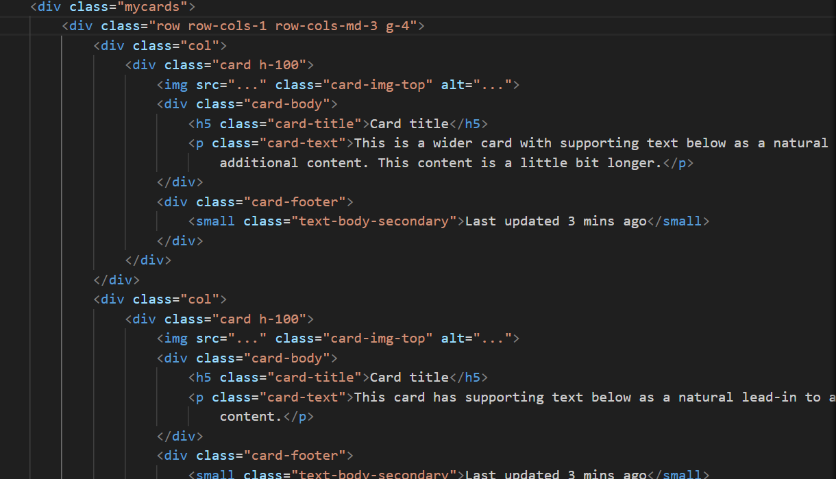
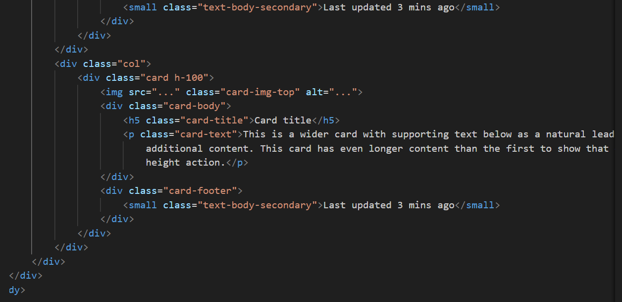
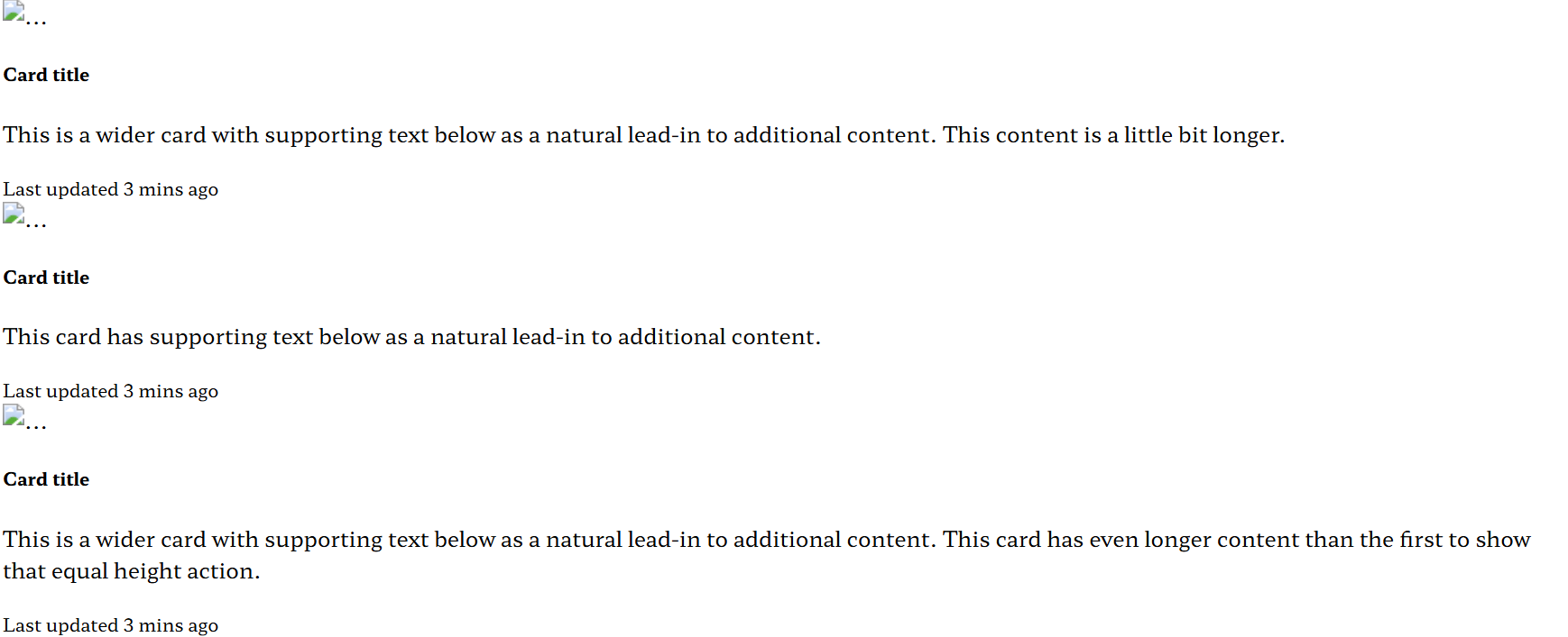
작성한 코드 및 에러 메세지
<!DOCTYPE html>
<html lang="en">
<head>
<meta charset="UTF-8">
<meta name="viewport" content="width=device-width, initial-scale=1.0">
<title>Document</title>
<style>
@import url('https://fonts.googleapis.com/css2?family=Hahmlet:wght@100..900&family=Noto+Sans+KR:wght@400;700&display=swap');
* {
font-family: "Hahmlet", serif;
}
.mytitle {
height: 250px;
color: white;
display: flex;
flex-direction: column;
align-items: center;
justify-content: center;
background-image: url('https://images.unsplash.com/photo-1511992243105-2992b3fd0410?ixlib=rb-4.0.3&ixid=M3wxMjA3fDB8MHxwaG90by1wYWdlfHx8fGVufDB8fHx8fA%3D%3D&auto=format&fit=crop&w=1470&q=80');
background-position: center;
background-size: cover;
}
.mytitle>button {
width: 150px;
height: 50px;
background-color: transparent;
color: white;
border: 1px solid white;
border-radius: 5px;
margin-top: 1px;
}
.mycards {}
</style>
</head>
<body>
<div class="mytitle">
<h1>나만의 추억앨범</h1>
<button>추억 저장하기</button>
</div>
<div class="mycards">
<div class="row row-cols-1 row-cols-md-3 g-4">
<div class="col">
<div class="card h-100">
<img src="..." class="card-img-top" alt="...">
<div class="card-body">
<h5 class="card-title">Card title</h5>
<p class="card-text">This is a wider card with supporting text below as a natural lead-in to
additional content. This content is a little bit longer.</p>
</div>
<div class="card-footer">
<small class="text-body-secondary">Last updated 3 mins ago</small>
</div>
</div>
</div>
<div class="col">
<div class="card h-100">
<img src="..." class="card-img-top" alt="...">
<div class="card-body">
<h5 class="card-title">Card title</h5>
<p class="card-text">This card has supporting text below as a natural lead-in to additional
content.</p>
</div>
<div class="card-footer">
<small class="text-body-secondary">Last updated 3 mins ago</small>
</div>
</div>
</div>
<div class="col">
<div class="card h-100">
<img src="..." class="card-img-top" alt="...">
<div class="card-body">
<h5 class="card-title">Card title</h5>
<p class="card-text">This is a wider card with supporting text below as a natural lead-in to
additional content. This card has even longer content than the first to show that equal
height action.</p>
</div>
<div class="card-footer">
<small class="text-body-secondary">Last updated 3 mins ago</small>
</div>
</div>
</div>
</div>
</div>
</body>
</html>


