


* 겪고 있는 문제 상황을 최대한 자세하게 작성해주세요.
* 문제 해결을 위해 어떤 시도를 해보았는지 구체적으로 함께 알려주세요.
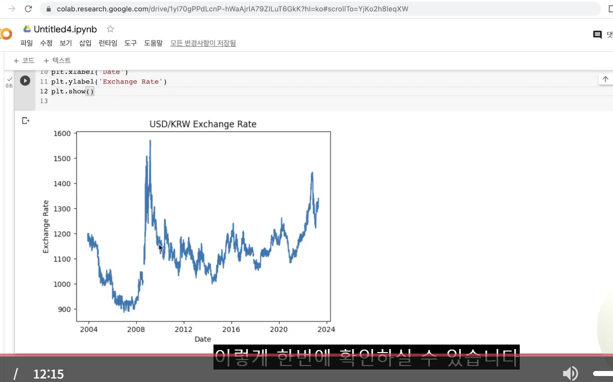
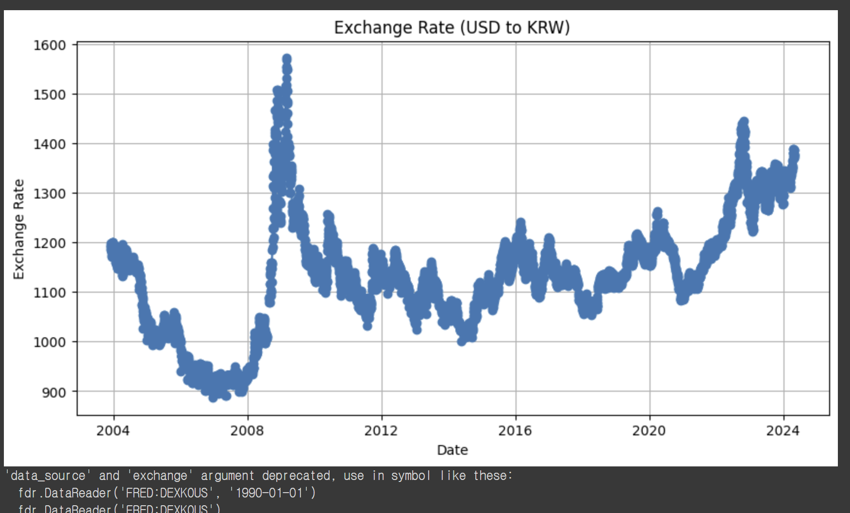
그래프는 제대로 나왔는데 강의화면과 다르게 선이 뚱뚱해요ㅜ 어떻게 수정할 수 있나요?
강의화면 그래프
작성한 그래프
import FinanceDataReader as fdr
import matplotlib.pyplot as plt
def plot_exchange_rate(country='USA'):
if country.upper() == 'USA':
exchange_rate = fdr.DataReader('USD/KRW', data_source='fred')
title = 'Exchange Rate (USD to KRW)'
elif country.upper() == 'KOREA':
exchange_rate = fdr.DataReader('KRW=X', data_source='yahoo')
title = 'Exchange Rate (KRW to USD)'
else:
print("Invalid country. Please enter 'USA' or 'KOREA'.")
return
plt.figure(figsize=(10, 5))
plt.plot(exchange_rate.index, exchange_rate['Close'], marker='o', linestyle='-')
plt.title(title)
plt.xlabel('Date')
plt.ylabel('Exchange Rate')
plt.grid(True)
plt.show()
# 미국 환율 정보 시각화
plot_exchange_rate('USA')
# 한국 환율 정보 시각화
plot_exchange_rate('KOREA')


