커뮤니티

포인트
쿠폰
내 강의실
국비 신청 내역
증명서
계정
로그아웃
학습 질문
개발 일지
나의 활동
답변 완료
마켓컬리 세부 레이아웃 구성이 잘 안돼요.. ㅠ
[왕초보] ChatGPT 300% 활용하기 v0
0주차


이*연
댓글
4
・
추천
0
・
조회수
9
조회수
9
답변 완료
챗 gpt 답변을 그대로 넣어도, 학습자료 값을 그대로 넣어도 레이아웃이 제대로 구현되지 않아요 ㅠㅠ
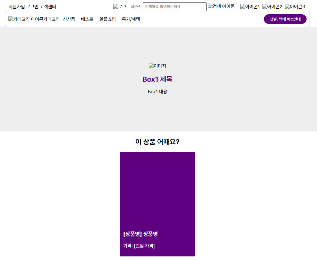
작성한 코드 및 에러 메세지
<!DOCTYPE html>
<html lang="ko">


<head>
    <meta charset="UTF-8">
    <title>나의 웹 사이트</title>
    <link rel="stylesheet" href="03_styles.css">
</head>


<body>
    <div class="container">
        <header>
            <div class="header-box1">
                <div class="right-align">
                    <span>회원가입</span>
                    <span>로그인</span>
                    <span>고객센터</span>
                </div>
            </div>
            <div class="header-box2">
                <div class="left-align">
                    <img src="logo.png" alt="로고">
                    <span style="color: #5F0080;">텍스트</span>
                </div>
                <div class="center-align">
                    <input type="text" placeholder="검색어를 입력해주세요">
                    <img src="search_icon.png" alt="검색 아이콘">
                </div>
                <div class="right-align">
                    <img src="icon1.png" alt="아이콘1">
                    <img src="icon2.png" alt="아이콘2">
                    <img src="icon3.png" alt="아이콘3">
                </div>
            </div>
        </header>


        <nav>
            <div class="left-align">
                <img src="category_icon.png" alt="카테고리 아이콘">
                <span>카테고리</span>
            </div>
            <div class="center-align">
                <span>신상품</span>
                <span>베스트</span>
                <span>알뜰쇼핑</span>
                <span>특가/혜택</span>
            </div>
            <div class="right-align">
                <button>샛별. 택배 배송안내</button>
            </div>
        </nav>


        <div class="box1">
            <div class="box1-content">
                <img src="image.jpg" alt="이미지">
                <h2>Box1 제목</h2>
                <p>Box1 내용</p>
            </div>
        </div>
        <div class="box2">
            <h2>이 상품 어때요?</h2>
            <div class="product-cards">
                <div class="product-card">
                    <div class="card-image">
                        <!-- 이미지가 있으면 이미지를 넣으세요 -->
                    </div>
                    <div class="card-content">
                        <h3>[상품명] 상품명</h3>
                        <p>가격: [랜덤 가격]</p>
                    </div>
                </div>
                <!-- 나머지 카드들도 같은 구조로 넣으세요 -->
            </div>
        </div>


    </div>
</body>


</html>
오류 발생 시, 작성한 코드 전체와 에러 메시지를 첨부해 주세요.
body {
  margin: 0;
  padding: 0;
}


.container {
  width: 100vw;
  height: 100vh;
  display: flex;
  flex-direction: column;
}


header {
  width: 1000px;
  margin: 0 auto;
  display: flex;
  justify-content: space-between;
  align-items: center;
}


.header-box1,
.header-box2 {
  display: flex;
  align-items: center;
}


.right-align {
  margin-left: auto;
}


.header-box2 .left-align img {
  margin-right: 10px;
}


.center-align {
  flex-grow: 1;
  text-align: center;
}


.header-box2 input {
  padding: 5px;
  width: 200px;
}


.header-box2 .right-align {
  margin-left: 20px;
}


.header-box2 .right-align img {
  margin-right: 5px;
}


nav {
  width: 1000px;
  margin: 0 auto;
  display: flex;
  justify-content: space-between;
  align-items: center;
  border: 1px solid lightgray;
  border-radius: 10px;
  padding: 10px;
}


nav div {
  display: flex;
  align-items: center;
}


nav .center-align span {
  margin: 0 10px;
}


nav .right-align button {
  border: none;
  border-radius: 20px;
  padding: 8px 20px;
  background-color: #5F0080;
  color: white;
}


.box1 {
  background-color: #eee;
  height: 350px;
  display: flex;
  justify-content: center;
  align-items: center;
}


.box1-content {
  max-width: 100%;
  text-align: center;
}


.box1-content img {
  max-width: 100%;
  height: auto;
}


.box1-content h2 {
  color: #5f0080;
  font-size: 24px;
  margin-top: 20px;
  margin-bottom: 10px;
}


.box1-content p {
  font-size: 16px;
  line-height: 1.5;
  margin-bottom: 0;
}


.box2 {
  width: 1000px;
  margin: 0 auto;
  text-align: center;
}


.product-cards {
  display: flex;
  justify-content: space-around;
  margin-top: 20px;
}


.product-card {
  width: 250px;
  height: 350px;
  background-color: #5f0080;
  color: white;
  display: flex;
  flex-direction: column;
  justify-content: space-between;
}


.card-image {
  width: 100%;
  height: 200px;
  background-color: #5f0080;
  display: flex;
  justify-content: flex-end;
  align-items: flex-end;
}


.card-image img {
  max-width: 80%;
  max-height: 80%;
  padding: 10px;
  background-color: rgba(255, 255, 255, 0.2);
}


.card-content {
  padding: 10px;
  text-align: left;
}


댓글 알림
