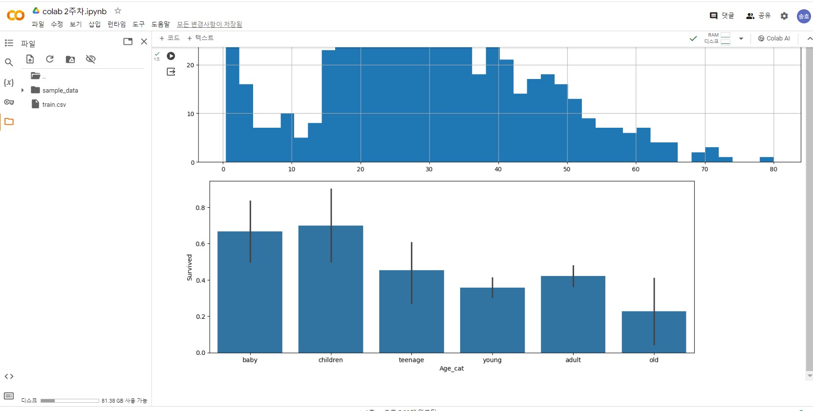
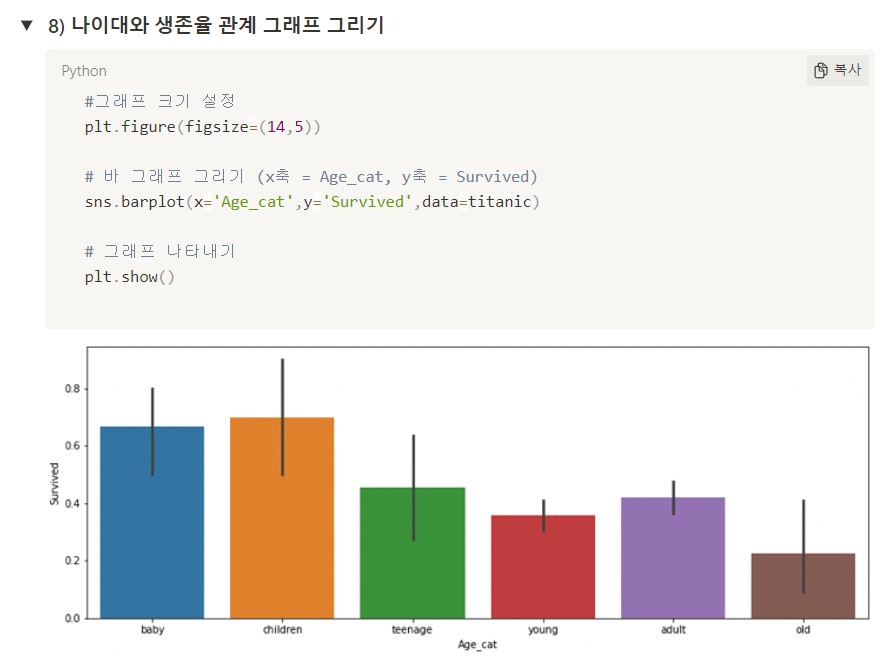
* 겪고 있는 문제 상황을 최대한 자세하게 작성해주세요.
* 문제 해결을 위해 어떤 시도를 해보았는지 구체적으로 함께 알려주세요.
강의와 소스 코드가 동일한데 그래프 바 색깔이 강의와 다르게 단색일까요?
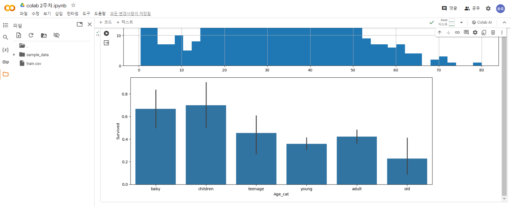
# 2-6 -[한걸음 더] - 타이타닉 생존자의 나이에 숨겨진 비밀
import pandas as pd
import matplotlib.pyplot as plt
import numpy as np
import seaborn as sns
titanic = pd.read_table('train.csv',sep=',')
titanic.head()
print(titanic.isnull().sum())
titanic = titanic.dropna()
titanic.describe()
#나이별로 히스토그램 구하기(분포도)
titanic['Age'].hist(bins=40,figsize=(18,8),grid=True)
#나이별 구분 및 각 나이별 생존율 확인 하기
titanic['Age_cat'] = pd.cut(titanic['Age'],bins=[0,3,7,15,30,60,100],include_lowest=True,labels=['baby','children','teenage','young','adult','old'])
#연령대를 기준으로 평균 값을 구해 볼수 있어요!
titanic.groupby('Age_cat').mean()
#그래프 크기 설정
plt.figure(figsize=(14,5))
# 바 그래프 그리기 (x축 = Age_cat, y축 = Survived)
sns.barplot(x='Age_cat',y='Survived',data=titanic)
# 그래프 나타내기
plt.show()