


* 겪고 있는 문제 상황을 최대한 자세하게 작성해주세요.
* 문제 해결을 위해 어떤 시도를 해보았는지 구체적으로 함께 알려주세요.
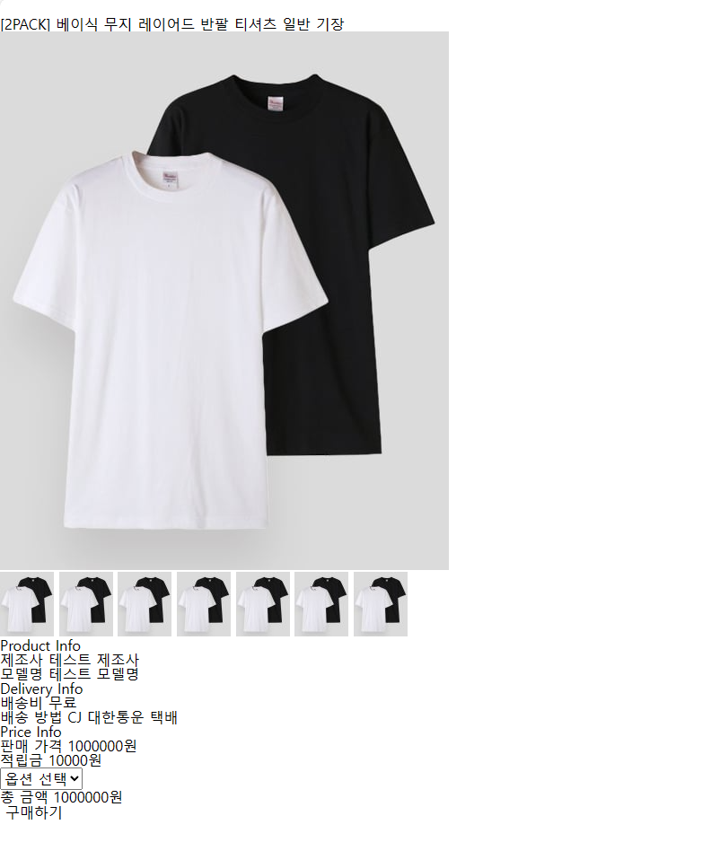
6주차 마지막 숙제에서 main left 박스와 main right 박스가 세로로 배치 되었는데요,
가로로 배치되게 하는 방법을 모르겠습니다.
ChatGPT에 몇 번을 질문해서 수정해 봐도 잘 되지 않습니다.
header {
height: 70px;
display: flex;
align-items: center;
justify-content: center;
background-color: #fff;
}
.header-wrapper {
display: flex;
align-items: center;
justify-content: center;
max-width: 1200px;
width: 100%;
padding: 0 20px;
}
.badge {
height: 26px;
padding: 0 10px;
font-size: 14px;
font-weight: bold;
background-color: #000;
color: #fff;
margin-right: 20px;
}
.product-title {
font-size: 24px;
font-weight: bold;
}
main {
max-width: 1200px;
margin: 0 auto;
display: flex;
justify-content: space-between;
padding: 50px 0;
}
.main-wrapper {
display: flex;
justify-content: space-between;
}
.main-left img {
width: 500px;
height: 600px;
}
.thumbnail-wrapper {
display: flex;
justify-content: space-between;
margin-top: 20px;
}
.thumbnail-wrapper img {
width: 60px;
height: 72px;
}
.main-right {
width: 400px;
margin-left: 20px;
}
.product-info,
.delivery-info,
.price-info,
.purchase {
margin-bottom: 20px;
}
.info-title {
font-size: 18px;
font-weight: bold;
}
.info-item {
display: flex;
justify-content: space-between;
margin-top: 10px;
}
.info-label {
font-weight: bold;
}
.total-price {
display: flex;
justify-content: space-between;
margin-top: 10px;
}
.total-label {
font-weight: bold;
}
.purchase-button {
background-color: #000;
color: #fff;
font-size: 16px;
font-weight: bold;
border: none;
padding: 10px 20px;
margin-top: 20px;
cursor: pointer;
}보고 계신 화면
전체를 캡처해 주시면, 튜터님들이 빠르게 상황을 이해할 수 있어요.


