


* 겪고 있는 문제 상황을 최대한 자세하게 작성해주세요.
* 문제 해결을 위해 어떤 시도를 해보았는지 구체적으로 함께 알려주세요.
전에 질문했던거와 질문의 내용은 같습니다.
모르고 질문완료를 눌러 다시 질문드립니다. 감사합니다.
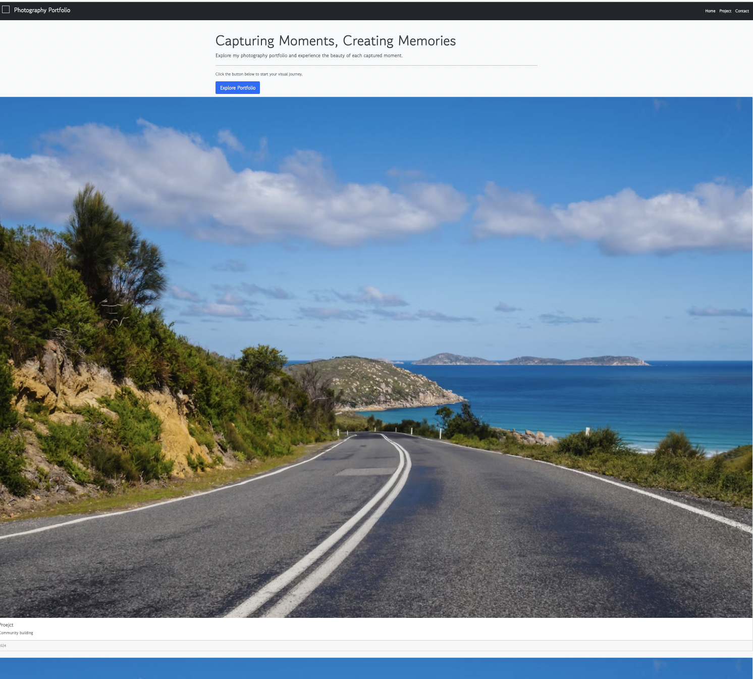
작성한 코드 및 에러 메세지
오류 발생 시, 작성한 코드 전체와 에러 메시지를 첨부해 주세요.
Tip 1) </> 아이콘을 눌러 코드박<!DOCTYPE html>
<html lang="en">
<head>
<meta charset="UTF-8">
<meta name="viewport" content="width=device-width, initial-scale=1.0">
<title>Photography Portfolio</title>
<link href="https://cdn.jsdelivr.net/npm/bootstrap@5.0.2/dist/css/bootstrap.min.css" rel="stylesheet"
integrity="sha384-EVSTQN3/azprG1Anm3QDgpJLIm9Nao0Yz1ztcQTwFspd3yD65VohhpuuCOmLASjC" crossorigin="anonymous">
<script src="https://ajax.googleapis.com/ajax/libs/jquery/3.5.1/jquery.min.js"></script>
<link rel="stylesheet" href="assets/style.css">
</head>
<body>
<header class="navbar navbar-dark bg-dark">
<div class="container-fluid">
<a class="navbar-brand" href="#">
<img src="" alt="" width="30" height="30" class="d-inline-block align-text-top">
Photography Portfolio
</a>
<nav class="" >
<ul class="nav col-12 col-lg-auto me-lg-auto mb-2 justify-content-center mb-md-0">
<li><a href="#" class="nav-link px-2 text-white">Home</a></li>
<li><a href="project.html" class="nav-link px-2 text-white">Project</a></li>
<li><a href="contact.html" class="nav-link px-2 text-white">Contact</a></li>
</ul>
</nav>
</form>
</div>
</header>
<div class="container mt-5">
<div class="jumbotron">
<h1 class="display-4">Capturing Moments, Creating Memories</h1>
<p class="lead">Explore my photography portfolio and experience the beauty of each captured moment.</p>
<hr class="my-4">
<p>Click the button below to start your visual journey.</p>
<a class="btn btn-primary btn-lg" href="#" role="button">Explore Portfolio</a>
</div>
</div>
<div class="mycards">
<div class="row row-cols-1 g-4">
<div class="col">
<div class="card h-100">
class="card-img-top" alt="...">
<div class="card-body">
<h5 class="card-title">Proejct</h5>
<p class="card-text">Community building</p>
</div>
<div class="card-footer">
<small class="text-muted">2024</small>
</div>
</div>
</div>
<div class="col">
<div class="card h-100">
class="card-img-top" alt="...">
<div class="card-body">
<h5 class="card-title">Project</h5>
<p class="card-text">Event Photography</p>
</div>
<div class="card-footer">
<small class="text-muted">2024</small>
</div>
</div>
</div>
<div class="col">
<div class="card h-100">
class="card-img-top" alt="...">
<div class="card-body">
<h5 class="card-title">Project</h5>
<p class="card-text">Family Photography</p>
</div>
<div class="card-footer">
<small class="text-muted">2025</small>
</div>
</div>
</div>
<div class="col">
<div class="card h-100">
class="card-img-top" alt="...">
<div class="card-body">
<h5 class="card-title">Project</h5>
<p class="card-text">Wedding Photography</p>
</div>
<div class="card-footer">
<small class="text-muted">2024</small>
</div>
</div>
</div>
</div>
</div>
<footer class="text-center p-3">
<p>© 2024 Your Photography Portfolio. All rights reserved.</p>
</footer>
<script src="https://cdn.jsdelivr.net/npm/@popperjs/core@2.11.6/dist/umd/popper.min.js"
integrity="sha384-13fOoUnvRi5ZLQZcxJADu8XeFJIEHuYNb1sp7Zl5FvxiF8zcZ2DE8h1Y3gEmZ3K3"
crossorigin="anonymous"></script>
<script src="https://cdn.jsdelivr.net/npm/bootstrap@5.0.2/dist/js/bootstrap.min.js"
integrity="sha384-B4gt1jrGC7Jh4AgTPSdUtOBvfO8sh+WyF68C4M1x0JwETqEeKhd2E2a6CJYLSKI" crossorigin="anonymous"></script>
</body>
</html>
스를 만들어 보세요.
Tip 2) Ctrl+A(맥의 경우 Command+A) 단축키로 코드를 한 번에 선택할 수 있어요!
/* Import fonts */
@import url('https://fonts.googleapis.com/css2?family=Gowun+Dodum&family=Tenor+Sans:wght@400&family=Roboto:wght@300&display=swap');
/* Apply fonts */
* {
font-family: 'Gowun Dodum', sans-serif;
}
body {
font-family: 'Roboto', sans-serif;
background-color: #f8f9fa; /* Light gray background */
color: #343a40; /* Dark text color */
}
header {
display: flex;
flex-direction: column;
align-items: center;
justify-content: center;
padding: 20px;
background-color: #343a40; /* Dark background for the header */
}
.navbar-brand {
text-decoration: none;
color: #fff; /* White text color for the brand */
font-size: 1.5rem; /* Font size for the brand */
margin-bottom: 10px; /* Add space between brand and menu */
}
.navbar-brand img {
margin-right: 10px; /* Add some spacing between the brand text and logo */
}
.menu {
display: block; /* Change display property to block */
text-align: center; /* Center the menu items */
margin-top: 10px; /* Add margin at the top to position below the brand */
}
.menu ul {
display: flex;
list-style: none;
padding: 0;
margin: 0;
}
.menu li {
margin-right: 5px; /* Add some spacing between menu items */
}
.menu a {
text-decoration: none;
color: #fff; /* White text color for the links */
font-size: 1rem; /* Font size for navigation links */
transition: color 0.3s ease-in-out; /* Smooth color transition on hover */
}
.menu a:hover {
color: #f8f9fa; /* Light gray color on hover */
}
.jumbotron {
margin : 10px;
color: #343a40; /* White text color for the jumbotron */
}
.mytitle {
background-color: #007BFF; /* Cinematic Blue */
color: white;
height: 250px;
display: flex;
flex-direction: column;
align-items: center;
justify-content: center;
background-image: linear-gradient(0deg, rgba(0, 0, 0, 0.2), rgba(0, 0, 0, 0.2)),
background-position: center;
background-size: cover;
}
.mytitle > button {
width: 150px;
height: 50px;
background-color: transparent;
border: none;
color: white;
font-size: 18px;
font-weight: bold;
border-radius: 5px;
border: 1px solid white;
margin-top: 20px;
}
.mycards {
}
.row-cols-1 {
width: 100%; /* Ensure cards take full width */
}
.card {
transition: transform 0.3s ease-in-out;
}
.card:hover {
transform: scale(1.05);
}
footer {
background-color: #343a40; /* Dark background for the footer */
color: #fff; /* White text color for the footer */
position: fixed;
bottom: 0;
width: 100%;
padding: 10px 0;
}
/* Additional styles for better responsiveness on smaller screens */
@media (max-width: 576px) {
.mycards {
max-width: 100%; /* Adjusted max-width for small screens */
}
}
/* Update the color of the button */
.mytitle > button {
background-color: #007BFF; /* Cinematic Blue */
border: 1px solid #007BFF; /* Cinematic Blue */
color: white;
}


