


* 겪고 있는 문제 상황을 최대한 자세하게 작성해주세요.
* 문제 해결을 위해 어떤 시도를 해보았는지 구체적으로 함께 알려주세요.
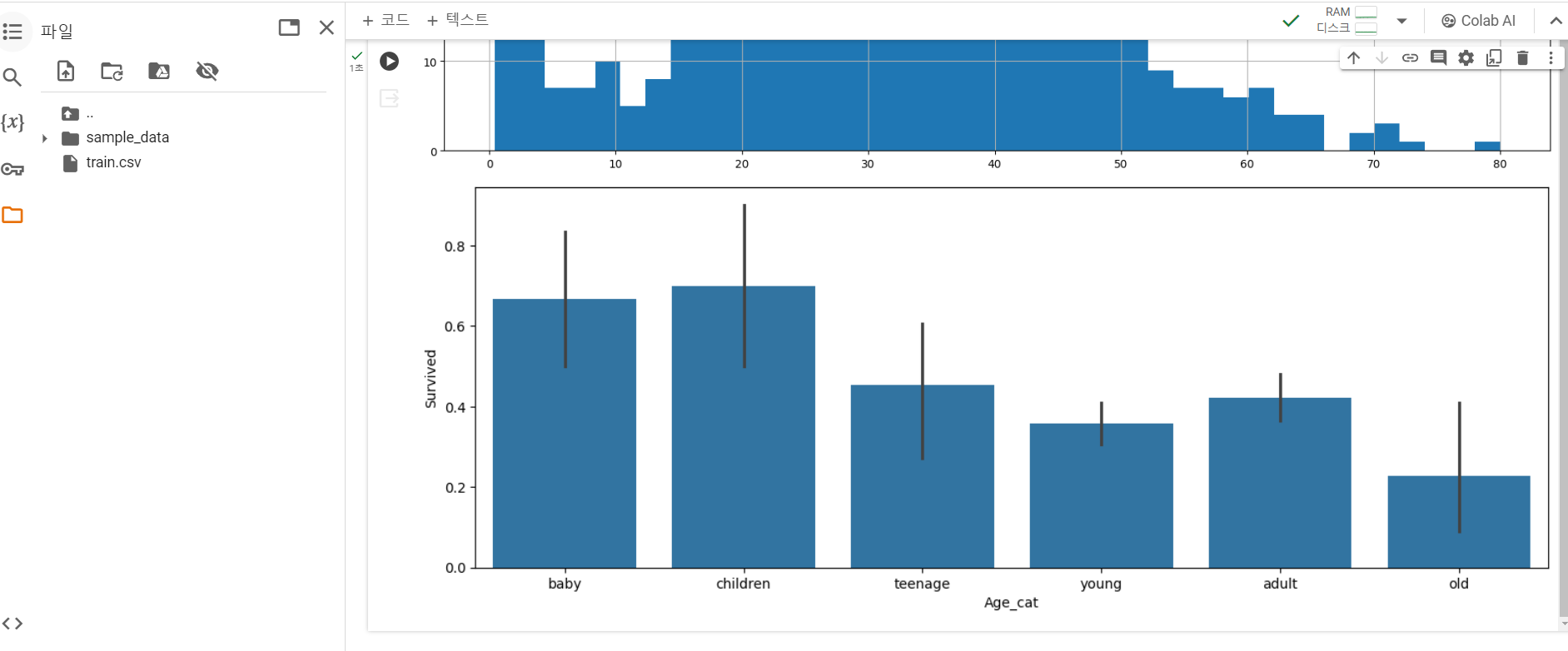
강의 2-6의 '나이대와 생존율 관계 그래프 그리기'에서 강사님이 하실 때는 막대그래프별로 색상이 다르게 나타났는데 제가 했을 때는 파란 색으로 동일하게 나타납니다. 어떤 차이가 있는 건가요?
import pandas as pd
import matplotlib.pyplot as plt
import numpy as np
import seaborn as sns
titanic = pd.read_table('train.csv',sep=',')
titanic.head()
titanic = titanic.dropna()
print(titanic.isnull().sum())
titanic.describe()
#나이별로 히스토그램 구하기
titanic['Age'].hist(bins=40,figsize=(18,8),grid=True)
#나이별 구분 및 각 나이별 생존율 확인 하기
titanic['Age_cat'] = pd.cut(titanic['Age'],bins=[0,3,7,15,30,60,100],include_lowest=True,labels=['baby','children','teenage','young','adult','old'])
#연령대를 기준으로 평균 값을 구해 볼수 있어요!
titanic.groupby('Age_cat').mean()
#그래프 크기 설정
plt.figure(figsize=(14,5))
# 바 그래프 그리기 (x축 = Age_cat, y축 = Survived)
sns.barplot(x='Age_cat',y='Survived',data=titanic)
# 그래프 나타내기
plt.show()


