


* 겪고 있는 문제 상황을 최대한 자세하게 작성해주세요.
* 문제 해결을 위해 어떤 시도를 해보았는지 구체적으로 함께 알려주세요.
이미지의 크기에 따라서 배너 크기가 변하게 하는 것. 또는, 배너의 크기에 따라서 이미지의 크기를 변하게 하는 방법을 알고 싶어요!
현재는 배너에 크기나 이미지의 크기가 고정되어서 아래 사진에서 보이는 것처럼 공백이 발생합니다. css를 손대야 할것 같은데 어떻게 해야할지 잘 모르겠어
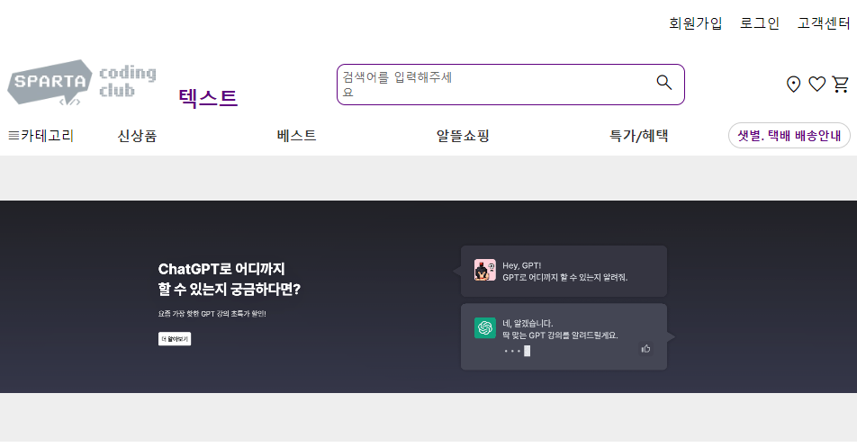
아래는 현재 css 코드 입니다.
body {
margin: 0;
padding: 0;
}
.container {
width: 100vw;
height: 100vh;
display: flex;
flex-direction: column;
}
header {
width: 1000px;
margin: 0 auto;
display: flex;
flex-direction: column;
height: 150px;
/* 높이 조정 */
}
.header-box1 {
display: flex;
justify-content: flex-end;
align-items: center;
height: 50%;
/* 높이 조정 */
}
.header-box1-right {
display: flex;
justify-content: space-between;
align-items: center;
}
.header-box1-right a {
color: #000;
text-decoration: none;
margin-left: 20px;
border-bottom: none;
}
.header-box2 {
display: flex;
justify-content: space-between;
align-items: center;
height: 50%;
/* 높이 조정 */
}
.header-box2-left img {
height: 60px;
margin-right: 20px;
}
.header-box2-left span {
font-size: 24px;
font-weight: bold;
}
.header-box2-center form {
display: flex;
align-items: center;
border: 2px solid #5F0080;
border-radius: 10px;
/* 모서리를 좀 덜 둥글게 */
padding: 5px;
width: 400px;
/* 가로 길이를 400px로 */
}
.header-box2-center input[type="text"] {
border: none;
font-size: 16px;
margin-right: 10px;
flex-grow: 1;
/* input을 늘리기 위해 추가 */
}
.header-box2-center button[type="submit"] {
border: none;
background: none;
cursor: pointer;
}
.header-box2-center form {
border-color: #5F0080;
/* 테두리 색상 변경 */
}
.header-box2-center label {
color: #666;
/* 회색으로 변경 */
font-size: 14px;
margin-right: 10px;
}
.header-box2-center input[type="text"] {
border: none;
font-size: 16px;
margin-right: 10px;
}
.header-box2-center button[type="submit"] {
border: none;
background: none;
cursor: pointer;
}
.header-box2-right {
display: flex;
justify-content: space-between;
align-items: center;
width: 80px;
}
.header-box2-right img {
height: 30px;
}
nav {
width: 1000px;
margin: 0 auto;
display: flex;
justify-content: space-between;
align-items: center;
height: 50px;
}
.nav-left {
display: flex;
align-items: center;
}
.nav-left img {
height: 30px;
margin-right: 5px;
}
.nav-left span {
font-size: 16px;
}
.nav-center {
display: flex;
justify-content: space-between;
align-items: center;
flex-grow: 1;
margin: 0 50px; /* 수정된 margin 값 */
}
.nav-center a {
color: #333;
text-decoration: none;
font-size: 16px;
margin-right: 20px;
font-weight: bold;
}
.nav-right {
display: flex;
align-items: center;
}
.btn {
border: 2px solid #ccc;
border-radius: 20px;
padding: 5px 10px;
background-color: transparent;
color: #5F0080;
font-size: 14px;
font-weight: bold;
cursor: pointer;
}
.btn:hover {
background-color: #5F0080;
color: #fff;
}
.box1 {
background-color: #eee;
height: 350px;
display: flex;
justify-content: center;
align-items: center;
}
.box1-content {
max-width: 100%;
text-align: center;
}
.box1-content img {
max-width: 100%;
height: auto;
}
.box1-content h2 {
color: #5f0080;
font-size: 24px;
margin-top: 20px;
margin-bottom: 10px;
}
.box1-content p {
font-size: 16px;
line-height: 1.5;
margin-bottom: 0;
}
.box2 {
width: 1000px;
margin: 0 auto;
text-align: center;
padding: 20px 0;
}
.box2-title {
color: #5f0080;
font-size: 24px;
margin-bottom: 20px;
}
.card-container {
display: flex;
justify-content: space-between;
align-items: center;
}
.card {
width: 23%;
border: 1px solid #ccc;
border-radius: 5px;
box-shadow: 0px 0px 5px 0px rgba(0, 0, 0, 0.2);
overflow: hidden;
margin-bottom: 20px;
}
.card-image {
position: relative;
}
.card-image img {
width: 100%;
height: auto;
}
.card-icon {
position: absolute;
bottom: 0;
right: 0;
background-color: rgba(95, 0, 128, 0.8);
padding: 5px;
}
.card-icon img {
width: 20px;
height: 20px;
}
.card-content {
text-align: left;
padding: 10px;
}
.card-content h3 {
margin: 0;
font-size: 16px;
}
.card-content p {
margin: 10px 0 0;
font-size: 14px;
font-weight: bold;
}


