


* 겪고 있는 문제 상황을 최대한 자세하게 작성해주세요.
* 문제 해결을 위해 어떤 시도를 해보았는지 구체적으로 함께 알려주세요.
plt.xticks([10,20,30,40,50]) 와 plt.bar(progressrate_by_age.index, progressrate_by_age)
에서 plt.bar(progressrate_by_age.index 의 영향
#그래프의 x축 눈금 설정
# plt.xticks([10,20,30,40,50])
#plt.bar(X축값, Y축값)
plt.bar(progressrate_by_age.index, progressrate_by_age) 인데
그래프에서는 x축 값이 10,20,30,40,50 로 나옵니다.
plt.bar(progressrate_by_age.index 때문인거 같은데요,
왜 plt.xticks([10,20,30,40,50])가 필요한가요?
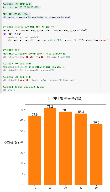
작성한 코드 및 에러 메세지
#plt.figure(width, height) : 넓이와 높이 만큼 이미지를 생성한다는 것을 말해줍니다!
plt.figure(figsize=(6,6))
#그래프의 x축 눈금 설정
# plt.xticks([10,20,30,40,50])
#plt.bar(X축값, Y축값)
plt.bar(progressrate_by_age.index, progressrate_by_age)
#그래프의 바에 각 수치율을 추가 해 볼까요?
bar = plt.bar(progressrate_by_age.index, progressrate_by_age,width=8)
for rect in bar:
height = rect.get_height()
plt.text(rect.get_x() + rect.get_width()/2.0, height, '%.1f' % height, ha='center', va='bottom', size = 12)
#그래프의 제목
#타이틀과 그래프와의 간격은 pad= 수치 로 나타내어요!
plt.title('[나이대 별 평균 수강율]',fontsize=15,pad=20)
#그래프의 x축 라벨 이름
#labelpad 파라미터는 축 레이블의 여백을 지정합니다.
plt.xlabel('나이',fontsize=12,labelpad=20)
#그래프의 y축 라벨 이름
plt.ylabel('수강생(명)',fontsize=14,rotation=360,labelpad=35)
#그래프를 화면에 나타나도록 합니다.
plt.show()


