


* 겪고 있는 문제 상황을 최대한 자세하게 작성해주세요.
* 문제 해결을 위해 어떤 시도를 해보았는지 구체적으로 함께 알려주세요.
2-11 강의에서 6:00까지 그대로 따라 해보았는데 저장해서 새로 고침 했을 때 카드가 가로가 아닌 세로로 나열됩니다. 뭐가 잘못 됐을까요?
보
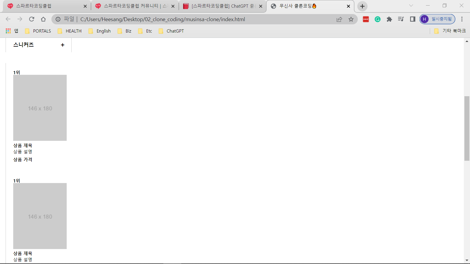
고 계신 화면 전체를 캡처해 주시면, 튜터님들이 빠르게 상황을 이해할 수 있어요.
작성한 코드 및 에러 메세지
오류 발생 시, 작성한 코드 전체와 에러 메시지를 첨부해 주세요.
Tip 1) <!DOCTYPE html>
<html lang="ko">
<head>
<meta charset="UTF-8">
<meta http-equiv="X-UA-Compatible" content="IE=edge">
<meta name="viewport" content="width=device-width, initial-scale=1.0">
<!-- reset.css 파일을 연결 -->
<link rel="stylesheet" href="reset.css">
<!-- style.css 파일을 연결 -->
<link rel="stylesheet" href="style.css">
<!-- Font Awesome CDN 연결 -->
<link rel="stylesheet" href="https://cdnjs.cloudflare.com/ajax/libs/font-awesome/5.15.3/css/all.min.css" />
<title>무신사 클론코딩🔥</title>
</head>
<body>
<header>
<div class="banner">
<img src="https://placehold.it/200x70" alt="무신사 배너">
<a href="#" class="close-btn"><i class="fas fa-times"></i></a>
</div>
<nav class="navigation1">
<div class="left-group">
<img src="https://placehold.it/100x30" alt="무신사 로고">
<div class="search-box">
<input type="text" placeholder="검색">
<button type="button"><i class="fas fa-search"></i></button>
</div>
<p>[1등] : 패션품목</p>
</div>
<div class="right-group">
<a href="#" class="pink">링크1</a>
<a href="#" class="red">링크2</a>
<a href="#" class="blue">링크3</a>
<a href="#">링크4</a>
<a href="#">링크5</a>
<a href="#">링크6</a>
<a href="#">링크7</a>
<a href="#">링크8</a>
<a href="#">링크9</a>
<a href="#">링크10</a>
<a href="#">링크11</a>
<a href="#">링크12</a>
</div>
</nav>
<nav class="navigation2">
<div class="left-group">
<a href="#">테라스 샵</a>
</div>
<div class="right-group">
<span>래플에 참여해 보세요!</span>
<a href="#" class="blue">래플 바로가기</a>
<a href="#">브랜드 구인</a>
</div>
</nav>
<nav class="navigation3">
<div class="left-box">
<button>로그인</button>
</div>
<div class="right-box">
<a href="#" class="blue">링크1</a>
<a href="#">링크2</a>
<a href="#">링크3</a>
<a href="#" class="red">링크4</a>
<a href="#">링크5</a>
<a href="#">링크6</a>
<a href="#">링크7</a>
<a href="#" class="blue">링크8</a>
</div>
</nav>
</header>
<main>
<section class="main-left">
<div class="main-left-top">
<button>품목</button>
<button>브랜드</button>
</div>
<div class="main-left-bottom">
<button>
<span class="left-text">여성</span>
<span class="right-icon"><i class="fas fa-plus"></i></span>
</button>
<button>
<span class="left-text">남성</span>
<span class="right-icon"><i class="fas fa-plus"></i></span>
</button>
<button>
<span class="left-text">언더웨어</span>
<span class="right-icon"><i class="fas fa-plus"></i></span>
</button>
<button>
<span class="left-text">스포츠</span>
<span class="right-icon"><i class="fas fa-plus"></i></span>
</button>
<button>
<span class="left-text">스니커즈</span>
<span class="right-icon"><i class="fas fa-plus"></i></span>
</button>
</div>
<section class="main-right">
<div class="card-container">
<div class="card">
<p class="rank">1위</p>
<img src="https://placehold.it/146x180" alt="상품 이미지">
<p class="title">상품 제목</p>
<p class="description">상품 설명</p>
<p class="price">상품 가격</p>
</div>
<div class="card">
<p class="rank">1위</p>
<img src="https://placehold.it/146x180" alt="상품 이미지">
<p class="title">상품 제목</p>
<p class="description">상품 설명</p>
<p class="price">상품 가격</p>
</div>
<div class="card">
<p class="rank">1위</p>
<img src="https://placehold.it/146x180" alt="상품 이미지">
<p class="title">상품 제목</p>
<p class="description">상품 설명</p>
<p class="price">상품 가격</p>
</div>
<div class="card">
<p class="rank">1위</p>
<img src="https://placehold.it/146x180" alt="상품 이미지">
<p class="title">상품 제목</p>
<p class="description">상품 설명</p>
<p class="price">상품 가격</p>
</div>
<div class="card">
<p class="rank">1위</p>
<img src="https://placehold.it/146x180" alt="상품 이미지">
<p class="title">상품 제목</p>
<p class="description">상품 설명</p>
<p class="price">상품 가격</p>
</div>
<!-- 99개의 card가 여기에 추가됨 -->
</div>
</section>
</main>
</body>
</html>
.banner {
display: flex;
justify-content: space-between;
align-items: center;
width: 100%;
height: 70px;
background-color: #000;
}
.banner img {
width: 100%;
height: 100%;
object-fit: cover;
}
.close-btn {
color: #fff;
margin-right: 20px;
font-size: 20px;
}
.navigation1 {
display: flex;
justify-content: space-between;
align-items: center;
width: 100%;
height: 78px;
background-color: #000;
padding: 0 15px;
}
.left-group {
display: flex;
align-items: center;
}
.left-group img {
margin-right: 15px;
}
.search-box {
position: relative;
margin-right: 15px;
}
.search-box input[type="text"] {
width: 200px;
padding: 5px 10px;
font-size: 14px;
background-color: #fff;
border: none;
border-radius: 3px;
}
.search-box button {
position: absolute;
top: 50%;
right: 0;
transform: translateY(-50%);
padding: 5px 10px;
background-color: #000;
border: none;
border-radius: 3px;
color: #fff;
font-size: 14px;
}
.search-box button i {
color: #fff;
}
.left-group p {
margin: 0;
font-size: 12px;
color: #fff;
}
.right-group {
display: flex;
align-items: center;
}
.right-group a {
margin-right: 15px;
font-size: 18px;
font-weight: bold;
text-decoration: none;
color: #fff;
}
.right-group a.pink {
color: pink;
}
.right-group a.red {
color: red;
}
.right-group a.blue {
color: blue;
}
.navigation2 {
display: flex;
justify-content: space-between;
align-items: center;
width: 100%;
height: 51px;
background-color: #ccc;
padding: 0 15px;
}
.navigation2 .left-group a {
font-size: 14px;
font-weight: bold;
text-decoration: none;
color: #000;
}
.navigation2 .right-group span {
font-size: 14px;
color: #000;
margin-right: 10px;
}
.navigation2 .right-group a {
font-size: 14px;
font-weight: bold;
text-decoration: none;
}
.navigation2 .right-group a.blue {
color: blue;
}
.navigation3 {
display: flex;
justify-content: left;
align-items: center;
width: 100%;
height: 50px;
background-color: #fff;
border-top: 1px solid #ccc;
border-bottom: 1px solid #ccc;
padding: 0 15px;
}
.navigation3 .box-container {
display: flex;
flex-direction: row;
}
.navigation3 .left-box {
display: flex;
justify-content: center;
align-items: center;
width: 200px;
}
.navigation3 .right-box {
display: flex;
justify-content: space-between;
align-items: center;
width: 400px;
}
.navigation3 button {
width: 150px;
height: 28px;
border: 1px solid #000;
background-color: #fff;
font-size: 12px;
color: #000;
}
.navigation3 a {
font-size: 12px;
color: #000;
}
.navigation3 a:first-child {
color: blue;
}
.navigation3 a:nth-child(4) {
color: red;
}
.navigation3 a:last-child {
color: blue;
}
.navigation3 .box-container>*+* {
margin-left: 10px;
}
.main-left {
display: flex;
flex-direction: column;
width: calc(100% / 6);
padding: 0 15px;
}
.main-left-top {
margin-top: 20px;
display: flex;
justify-content: space-between;
}
.main-left-top button {
width: calc(50% - 5px);
height: 40px;
border: 1px solid #ccc;
background-color: #fff;
font-size: 12px;
font-weight: bold;
color: #000;
}
.main-left-top button:first-child {
border-right: none;
}
.main-left-bottom {
margin-top: 30px;
}
.main-left-bottom button {
width: 100%;
height: 40px;
border: 1px solid #ccc;
background-color: #fff;
display: flex;
justify-content: space-between;
align-items: center;
}
.main-left-bottom button .left-text {
margin-left: 14px;
font-size: 14px;
font-weight: bold;
color: #000;
}
.main-left-bottom button .right-icon {
margin-right: 14px;
color: #ccc;
}
.main-left-bottom button:hover {
background-color: #f9f9f9;
}
.main-left-bottom button:hover .right-icon {
color: #000;
}
.main-left-bottom button:last-child {
margin-bottom: 30px;
border-bottom: none;
}
.main-left-bottom button .right-icon i {
font-size: 10px;
}
.main-right {
width: calc(83.3333%);
/* 전체 화면의 5/6 */
border-left: 1px solid #ccc;
}
.card-container {
display: flex;
flex-wrap: wrap;
width: 100%;
max-width: 1198px;
/* 6 * 200 - 2 */
margin: 0 auto;
}
.card {
width: 200px;
max-height: 287px;
background-color: #fff;
margin: 10px;
padding: 10px;
}
.rank {
margin: 0;
font-size: 12px;
font-weight: bold;
color: #000;
}
.title,
.description,
.price {
margin: 5px 0;
font-size: 12px;
color: #000;
}
.title {
font-weight: bold;
}
.price {
font-weight: bold;
margin-top: 10px;
}/> 아이콘을 눌러 코드박스를 만들어 보세요.
Tip 2) Ctrl+A(맥의 경우 Command+A) 단축키로 코드를 한 번에 선택할 수 있어요!


