


* 겪고 있는 문제 상황을 최대한 자세하게 작성해주세요.
* 문제 해결을 위해 어떤 시도를 해보았는지 구체적으로 함께 알려주세요.
그대로 따라했는데 정렬이 화면에 따라 바뀝니다!
2개 정렬로 하고 싶어요!
영상에선 <div class="row flex-row wrap"> 라고 적혀있는데
질문들 보니 row를 빼면 된다고 해서 해봣는데 안되네요!
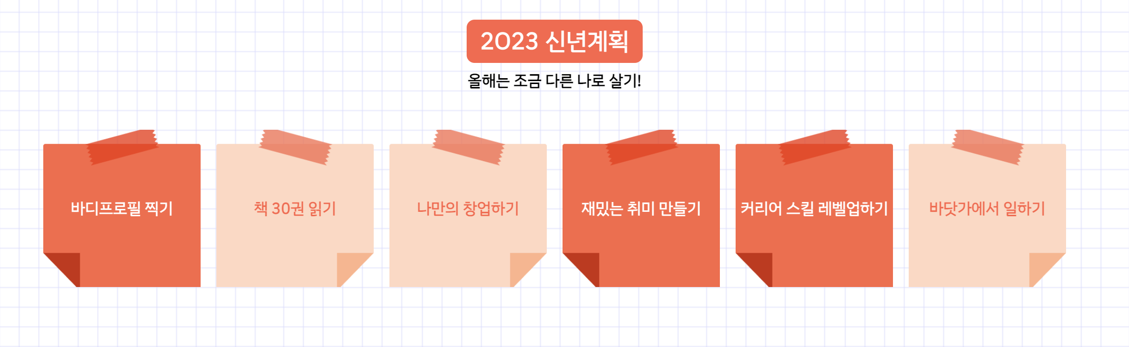
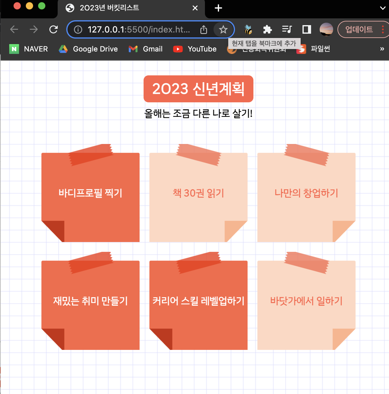
작성한 코드 및 에러 메세지
<!DOCTYPE html>
<html lang="en">
<head>
<meta charset="UTF-8">
<meta http-equiv="X-UA-Compatible" content="IE=edge">
<meta name="viewport" content="width=device-width, initial-scale=1.0">
<title>2O23년 버킷리스트</title>
<style>
@import url('https://fonts.googleapis.com/css2?family=IBM+Plex+Sans+KR&display=swap');
* {
font-family: 'IBM Plex Sans KR', sans-serif;
}
.title {
color: white;
background-color: tomato;
font-size: 24px;
padding: 4px 14px;
border-radius: 8px;
}
.bg {
width=360px;
background-image: url("https://s3.ap-northeast-2.amazonaws.com/materials.spartacodingclub.kr/bucketList/bg-grid.png");
}
.msg {
font-weight: bold;
}
.bucket {
width: 160px;
height: 160px;
}
.img1 {
background-image: url("https://s3.ap-northeast-2.amazonaws.com/materials.spartacodingclub.kr/bucketList/bucket-red.png");
background-size: cover;
background-position: center;
}
.img2 {
background-image: url("https://s3.ap-northeast-2.amazonaws.com/materials.spartacodingclub.kr/bucketList/bucket-lightred.png");
background-size: cover;
background-position: center;
}
</style>
<link rel="stylesheet" type="text/css" href="https://s3.ap-northeast-2.amazonaws.com/materials.spartacodingclub.kr/bucketList/sparta-bucket2.css">
</head>
<body class="bg center">
<h1 class="title">2O23 신년계획</h1>
<p class="msg">올해는 조금 다른 나로 살기!</p>
<div class="flex-row wrap">
<div class="bucket img1 center">바디프로필 찍기</div>
<div class="bucket img2 center">책 30권 읽기</div>
<div class="bucket img2 center">나만의 창업하기</div>
<div class="bucket img1 center">재밌는 취미 만들기</div>
<div class="bucket img1 center">커리어 스킬 레벨업하기</div>
<div class="bucket img2 center">바닷가에서 일하기</div>
</div>
</body>
</html>오류 발생 시, 작성한 코드 전체와 에러 메시지를 첨부해 주세요.
Tip 1) </> 아이콘을 눌러 코드박스를 만들어 보세요.
Tip 2) Ctrl+A(맥의 경우 Command+A) 단축키로 코드를 한 번에 선택할 수 있어요!


