커뮤니티

포인트
쿠폰
내 강의실
국비 신청 내역
증명서
계정
로그아웃
학습 질문
개발 일지
나의 활동
답변 완료
1-10강의) 'display: flex; flex-direction: column; alightn-items: center; justify-content: center;'이게 안먹혀요
undefined주차


김*희
댓글
3
・
추천
0
・
조회수
6
조회수
6
답변 완료
* 겪고 있는 문제 상황을 최대한 자세하게 작성해주세요.
* 문제 해결을 위해 어떤 시도를 해보았는지 구체적으로 함께 알려주세요.
제가 코드 완성본하고 비교해보면 맞게 파이참에 HTML을 입력했다고 생각합니다.
그런데
display: flex;
flex-direction: column;
aligh-items: center;
justify-content: center;
이렇게 넣었으면
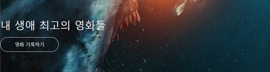
'내 생애 최고의 영화들'과 '영화 기록하기'가 가운데로 이동해야 하는데 왼쪽에 치우쳐져 있어요.
왜 그럴까요? 구글을 껐다가 다시 켜봐도 이래요..

<!doctype html>
<html lang="en">

<head>
    <meta charset="utf-8">
    <meta name="viewport" content="width=device-width, initial-scale=1, shrink-to-fit=no">

    <link href="https://cdn.jsdelivr.net/npm/bootstrap@5.0.2/dist/css/bootstrap.min.css" rel="stylesheet"
        integrity="sha384-EVSTQN3/azprG1Anm3QDgpJLIm9Nao0Yz1ztcQTwFspd3yD65VohhpuuCOmLASjC" crossorigin="anonymous">
    <script src="https://ajax.googleapis.com/ajax/libs/jquery/3.5.1/jquery.min.js"></script>
    <script src="https://cdn.jsdelivr.net/npm/bootstrap@5.0.2/dist/js/bootstrap.bundle.min.js"
        integrity="sha384-MrcW6ZMFYlzcLA8Nl+NtUVF0sA7MsXsP1UyJoMp4YLEuNSfAP+JcXn/tWtIaxVXM"
        crossorigin="anonymous"></script>

    <title>스파르타코딩클럽 | 부트스트랩 연습하기</title>
    <style>
      .mytitle {


          width: 100%;
          height: 250px;

          background-image: url("https://movie-phinf.pstatic.net/20210715_95/1626338192428gTnJl_JPEG/movie_image.jpg");
          background-position: center;
          background-size: cover;

          color: white;

          display: flex;
          flex-direction: column;
          justify-content: center;
          aligh-items: center;


      }
      .mytitle > button {
          width: 200px;
          height: 50px;

          background-color: transparent;
          color: white;

          border-radius: 50px;

          border: 1px solid white;

          margin-top: 10px;
      }
      .mytitle > button:hover {
          border: 2px solid white;
      }
    </style>
</head>

<body>
   <div class="mytitle">
     <h1>내 생애 최고의 영화들</h1>
     <button>영화 기록하기</button>
   </div>
</body>

</html>


댓글 알림
